

Every Dashboard Eventually Becomes an Excel Export
The Analyst Playbook #004


A few years ago, I watched a perfectly good pharmacy claims dashboard die in real time.
It started with a reasonable request.
The original dashboard tracked claim approval rates, turnaround times, and rejection trends across major pharmacy groups. Clean layout. Clear operational purpose. You could open it during a morning meeting and immediately spot whether prior authorization delays or adjudication issues were getting worse.
Then somebody asked:
“Can we make it more granular?”
Sure.
At first, the additions made sense.
Break it out by payer.
Then by pharmacy chain.
Then specialty vs. retail.
Then by rejection reason.
Then by drug class.
Then by plan type.
Then by region.
Then by prescriber network.
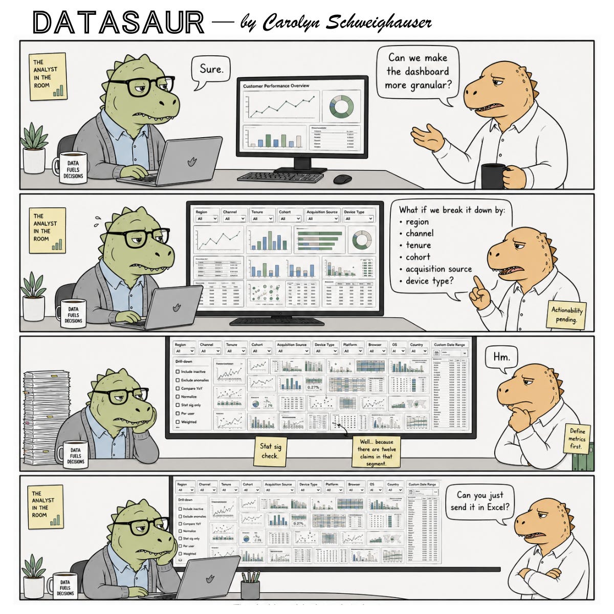
By the end of the project, the dashboard looked like it had been assembled by a committee trying to lose a hostage negotiation. Tiny charts everywhere. Filters consuming half the screen. Tabs multiplying weekly. Metrics recalculating differently depending on which combination of slicers someone touched first. And naturally, once the data got granular enough, people started questioning why some categories had unstable trends.
“Well… because there are twelve claims in that segment.”
Now the analyst is explaining sample size limitations during meetings that were originally supposed to be about operational performance. After weeks of rebuilding logic, validating denominator definitions, optimizing query performance, and carefully documenting metric caveats, what was the end result?
“Can you just send us the raw claims export in Excel?”
Every analyst who has worked in healthcare, pharmacy operations, or claims reporting just felt their blood pressure rise slightly. The painful part isn’t the Excel request itself. It’s realizing the organization never actually wanted a dashboard sophisticated enough to support all those dimensions operationally.
They wanted the comfort of knowing the detail existed.
The Quiet Assumption Behind “More Granular”
When stakeholders ask for more granularity, they’re usually imagining one of two things:
They believe the additional detail will reveal a hidden insight.
They want the ability to answer future questions without coming back to the analyst.
The second one drives far more dashboard complexity than people realize.
A lot of dashboards are not built for decision-making. They’re built as insurance policies against future uncertainty.
What if leadership asks for this later?
What if we need to filter by campaign?
What if somebody wants to isolate one subgroup next quarter?
So the dashboard grows. Despite the fact that not every view matters, nobody wants to be caught without the one that leadership calls out specifically.
The problem is that analytical usefulness does not scale linearly with dimensionality. At some point, additional granularity stops clarifying reality and starts fragmenting it.
You end up with:
metrics nobody trusts at smaller sample sizes
charts too dense to interpret quickly
definitions that drift between filters
performance issues nobody planned for
stakeholders overwhelmed by choice
analysts quietly becoming full-time dashboard maintenance technicians
And somehow the “single source of truth” now requires a guided tour.
Most Granularity Requests Are Really Uncertainty Requests
A stakeholder asking for more breakdowns is often signaling discomfort, not analytical precision. They’re trying to reduce uncertainty. The dashboard becomes a psychological safety blanket.
If every possible slice exists, then theoretically no question can surprise us later.
But reality doesn’t work that way.
Because once you provide five dimensions, somebody asks for seven. Once you provide seven, they want cross-filtering. Then custom date ranges. Then export functionality. Then drill-throughs.
Eventually you’ve built a BI-themed escape room nobody enjoys using.
And the cruelest part? Many of the additional views never meaningfully influence a decision. They exist because “it might be useful someday.”
Analysts know this instinctively because we see usage patterns. The same three tabs get used constantly. The other fourteen collect dust like abandoned gym equipment purchased during a motivational phase.
Granularity Has a Cognitive Cost
This is the part organizations constantly underestimate. Every additional filter, segmentation, and dimension adds interpretation burden. Not just technical complexity. Mental complexity.
A clean dashboard answers questions quickly.
An overloaded dashboard creates work for the user.
Now the stakeholder has to decide:
which filters matter
which cuts are statistically meaningful
which differences are noise
which metrics are comparable
which views conflict
which timeframe should anchor interpretation
At a certain point, the dashboard stops delivering clarity and starts outsourcing analytical labor back to the audience.
That’s why highly effective operational dashboards are often surprisingly simple.
Not simplistic. Focused. There’s a difference.
Good analysts learn that omission is part of analytical judgment. Sometimes the smartest thing you can do is not add the extra dimension.
The Real Job Isn’t Building Every Possible View
It’s helping people make better decisions faster.
A lot of junior analysts accidentally optimize for comprehensiveness because it feels safer politically. If every possible cut exists, nobody can accuse you of “missing something.”
But experienced analysts eventually realize this creates a different problem: the signal gets buried under defensive architecture.
You start building dashboards designed to survive stakeholder scrutiny instead of dashboards designed to improve operational clarity.
Those are very different products.
One useful question I’ve started asking before adding granularity is:
“What decision changes if we see this broken out further?”
That question kills a surprising number of requests. That doesn’t mean the stakeholder is wrong in their request. More often it is because nobody has actually connected the segmentation to an action yet.
And if the answer is vague — “it’d be nice to know” — that’s usually a warning sign.
Because there’s a massive difference between:
interesting data
explorable data
actionable data
Organizations blend those together constantly.
The Excel Ending Is What Makes the Joke Hurt
The Datasaur comic works because the final panel lands on something painfully real.
The joke here is not that Excel is bad. Excel is flexible, fast, familiar, and easy for ad hoc exploration. Most analysts know this already.
The joke is that organizations often request layers of sophistication they never intended to operationalize.
Weeks of dashboard refinement sometimes collapse into: “Can you export the raw data?”
The analyst didn’t fail. The actual need was flexibility, not visualization.
Sometimes stakeholders genuinely need structured reporting.
Sometimes they need exploratory tooling.
Sometimes they need monitoring.
Sometimes they just need a spreadsheet they can manipulate during a meeting.
Those are different use cases pretending to be one request. And a lot of analytics friction comes from treating them as interchangeable.
The Best Analysts Protect Clarity
Not every dashboard should become a universal analytics platform.
Not every metric deserves infinite drill-down capability.
Not every stakeholder request should become permanent architecture.
Part of analytical maturity is recognizing that clarity is fragile.
Once a dashboard crosses a certain complexity threshold, usefulness starts dropping fast. The interface technically contains more information while practically delivering less understanding.
That’s the granularity trap.
Most teams fall into it simply because everyone involved is trying to be helpful.
The stakeholder wants flexibility.
The analyst wants to be responsive.
Leadership wants confidence.
Nobody intentionally sets out to build a reporting labyrinth.
Yet somehow there’s always a dashboard with seventeen filters and a refresh time long enough to make you question your life choices.
The dashboard had tried its best.
If this felt painfully familiar, you’re probably exactly who The Analyst’s Playbook is for.
What’s a time you were asked to “look at it a different way” — and knew exactly what that meant? Drop it in the comments. I read every one.
If you know an analyst who’s held a number under pressure and said nothing about it after — send this to them.
Subscribe to Analyst in the Room for more on how analytics work actually feels inside real organizations — not just how it looks in conference talks and vendor demos.
This is a comprehensive and in-depth post! “The best analysis protect clarity” is well-summarized. More granularity sometimes may reduce clarity, not improve it. This made me think about medical research, an appropriate sample size (N) renders the research more efficient and the insight or conclusion more reliable. Analytical values rise with sample size at first, but after the study is adequately powered, further increases in detail mostly improve precision rather than insight, and sometimes may even create misleading statistical significance for clinically trivial effects. Very interesting analysis!
I love the comparison to medical research. There's definitely a diminishing return on granularity. At some point, we're no longer improving understanding, we're just narrowing confidence intervals around a conclusion we already had.
Clarity is often a signal that we've found the right level of detail.